ColorNote Notepad Notes
- 4.9
- Rating
- 100.00M
- Installs
- Free
- Price

 Analysis by App-foxy
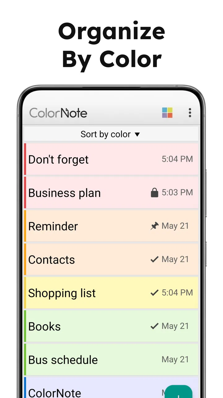
When I need to capture something before it disappears from my mind, I want the smallest possible barrier between the thought and the note. That is the main reason ColorNote Notepad Notes has stayed useful for me. It is a productivity app from Notes that focuses on quick writing, simple organization, and to-do lists instead of trying to become a complete office suite. After using it as a lightweight place for reminders, shopping lists, short plans, and loose ideas, I see its biggest strength clearly: color is not just decoration here; it becomes a practical way to recognize the kind of note I am looking for.
The app is free, suitable for Everyone, and its current version is 4.8.2. It has reached over 100 million installs, with a 4.9 average from around 3.9 million ratings and roughly 259 thousand written reviews. Those figures explain why it is familiar to so many Android users, but popularity alone is not what makes it worth keeping. The real question is whether a color-based notepad fits the way you think and work. In my experience, it does when speed matters more than elaborate structure.
Color is the organizing tool, not merely a visual extra
Many note apps treat organization as a second step. You write first, then later create folders, labels, notebooks, or filters. That can be powerful, but it also means the note may remain an unclassified item for days. ColorNote takes a more immediate approach. A note can be recognized visually as part of a group, so a glance at the note list can tell me whether I am looking at errands, personal ideas, work reminders, or something temporary.
You May Also Like

 Blood Strike: 2.5 Anniversary
Blood Strike’s Loadouts Turn Every Drop Into a Tactical Gamble
A close look at Blood Strike’s custom loadouts: how fast access to signature weapons reshapes its battle royale rhythm, rewards preparation, and narrows the gap between fights.

 Pandora - Music & Podcasts
Pandora’s Music Is Easy to Start, but Harder to Recover
Pandora’s strength is its low-effort path from a seed to a station. Its weak spot is how much confidence it asks you to place in connection, setup, and quiet recovery.

 8 Ball Pool
 Is Built on Rivalries, Rematches, and Routine
A close look at the rivalries, rematches, shared routines, and unanswered safety questions that turn a quick pool match into a persistent mobile community.

 Samsung Music
’s Quiet Strength Is Playing What You Already Own
Its reach comes less from spectacle than from dependable access to a personal library. That simplicity is both the app’s strongest retention engine and its ceiling.

 AccuWeather: Weather Radar
AccuWeather Review: A Quick, Clear Forecast for Everyday Decisions
For everyday plans, the best forecast is the one you can understand quickly. AccuWeather makes rain timing, radar, and local conditions easy to act on, with a few trade-offs.

 Hill Climb Racing
Why Hill Climb Racing Still Turns Crashes Into One More Run
A tiny car, a bumpy hill and one more upgrade: Hill Climb Racing keeps resurfacing because its simple chaos makes every near-miss feel personal.
More From Our News Desk
View All News


This changes the experience in a subtle way. I do not need to remember the exact title of a note to find it. I can scan for its color and then read the short heading. That is especially helpful when the list contains many brief notes rather than a few long documents. A color convention becomes a kind of visual shorthand: one shade for things I must act on, another for information I want to keep, and another for ideas that may never become tasks.
The useful insight is to choose colors by action, not by subject. If I assign colors only to topics, I can end up with too many categories. If I use them to show what should happen next, the system stays easier to maintain. For example, a note about a doctor appointment and a note about renewing a subscription may belong to different subjects, but both can share the same action-oriented color if they require attention. This makes the color system more durable than a collection of arbitrary labels.
There is also a psychological benefit. A long list of plain text can make every item look equally important. Color lets me distinguish urgent-looking material from reference notes without rewriting every title. I still need to use judgment, because a bright color does not automatically create a reminder or guarantee that I will act. However, it reduces the visual effort required to decide where to look first.
Turning quick notes into a small personal system
I find the app most effective when I begin with a simple rule: write immediately, organize lightly, and clean up later. The first note should not become a miniature project. I can capture a phone number, a recipe adjustment, a short packing list, or an idea for a future task without stopping to design a filing system. Once the thought is safely recorded, I can give it a color that reflects its role.
That workflow is different from using a large task manager. A task manager usually asks me to decide on due dates, projects, priorities, and sometimes recurring behavior. Those tools are better when I need a dependable system for many commitments. ColorNote is more comfortable when the note itself is the important thing and organization should remain visible but uncomplicated.
For me, the best practice is to keep titles concrete. “Things” is difficult to recognize even when the color is correct. “Questions for the apartment inspection” is much easier to scan. The color then provides the second layer of information rather than carrying the entire burden. This combination of a clear title and a consistent shade is more reliable than either one by itself.
Another useful habit is separating temporary notes from notes I expect to revisit. Temporary notes can have a color that tells me they are safe to review and remove after the relevant event. Permanent reference notes can use a calmer, separate color. This prevents the note list from becoming a graveyard of old reminders. The app is simple enough that the quality of the system depends heavily on these personal rules, but that is also what makes it quick to adapt.
How it feels in everyday use
The opening experience is straightforward: I can create a note without navigating through a complicated workspace. That matters when I am standing in a shop, moving between meetings, or trying to record an idea before it changes. The app’s central purpose stays visible, and I am not pushed toward features that I do not need for a two-line reminder.
Text notes work well for information that benefits from a little context. I can write a short explanation rather than relying on a single task label. To-do lists suit a different kind of thinking: each item can represent a clear action, which makes a shopping trip or preparation routine easier to follow. I like keeping those two formats separate because a paragraph and a checklist answer different needs. One preserves information; the other helps me move through actions.
A realistic example is preparing for a weekend away. I might create one note for items to pack, another for errands before leaving, and a third for addresses or details I want available during the trip. The packing note works as a checklist, while the other two are better as short text notes. Giving them related but distinct colors helps me move between preparation and reference information without combining everything into one crowded page.
That scenario also reveals an important limitation: the app helps me remember and arrange information, but I still have to open it and review the relevant note. It is not a substitute for a calendar when a specific time matters, and it should not be treated as a full project-management system. I use it as the fast capture layer, then move genuinely time-sensitive commitments to a tool designed around schedules when necessary.
Color choices are most useful when they remain stable. Changing the meaning of a color every few days destroys the visual advantage. I recommend starting with three or four meanings, not assigning every available shade immediately. One can represent action, one reference, one personal material, and one temporary content. If the list grows, the titles and note content can provide finer detail without forcing the color system to become complicated.
A workflow for shopping, errands, and short-term planning
For a shopping list, I prefer one item per line and a title that identifies the trip or purpose. That makes the note easy to scan while walking through a store. For errands, I write the destination or outcome in each line rather than vague verbs. “Return package” is more useful than “package,” because it tells me what completion means. The app does not need to supply elaborate planning features when the note itself is written clearly.
I also use a separate note for information that supports the list. If I put quantities, alternatives, and reminders into every checklist item, the list becomes harder to read. Keeping supporting details in a companion note gives me a quick action view and a fuller reference view. A shared color family can make those notes feel connected without merging them.
At the end of the errand, I review the note and remove completed material or retire the note according to my own system. This small cleanup step is important. A quick notepad can become less useful when old lists remain mixed with current ones. The app makes capture easy, but it does not make personal maintenance unnecessary.
Using it for ideas without turning them into obligations
Not every note should become a task. I use a different color for fragments that I may develop later: a meal idea, a sentence for a project, a gift thought, or a question I want to investigate. This prevents the main task color from becoming overloaded. When I review those notes, I can decide whether an idea deserves a proper plan or whether it was only useful in the moment.
This is one place where a simple notepad can feel better than a structured productivity platform. A large system may encourage me to assign a status to every thought. ColorNote lets me preserve an idea with very little ceremony. The trade-off is that discovery depends on my visual habits and note titles rather than on deep project relationships or advanced search logic.
The best scenario: a busy day with many small decisions
The strongest use case is a day filled with small pieces of information that do not justify separate documents. Imagine a morning when I need to remember a few work questions, a grocery item, a repair detail, and a personal idea. Creating one elaborate workspace for all of that would be unnecessary. Creating several quick notes, then giving each a meaningful color, keeps the information close without making the day feel more complicated.
During the day, the colors act as a visual map. I can look for the work-related shade before a conversation, the errand shade while I am outside, and the personal shade later. I do not need to remember a folder hierarchy or reconstruct where I stored each thought. The method works because the organization happens at the moment of capture, when the context is still fresh.
This is also useful for people who switch between devices or situations and dislike carrying a paper notebook. A digital note can be edited as details change, while a checklist can be adjusted as tasks are completed. The app remains focused enough that opening it does not feel like entering a large productivity environment. For quick personal organization, that low friction is more valuable to me than a long feature list.
However, I would not use this approach for a complex project with many contributors, dependencies, deadlines, or formal documents. Color can show broad meaning, but it cannot replace a project board, a shared document system, or a calendar-based workflow. If several people need to edit, comment, assign, and track work, a more specialized tool is likely the better choice.
Where the simplicity helps and where it creates friction
The clearest advantage is speed. The app does not make me build a structure before I can write. That makes it a good companion for fleeting thoughts and ordinary lists. Its free availability also lowers the barrier to trying it, while in-app purchases ranging from $1.99 to $15.99 per item mean that some optional spending may be present for users who want more than the basic experience.
The same simplicity can feel limiting when my information becomes more connected. A note list is not the same as a database. Colors help me recognize groups, but they do not automatically explain relationships between notes. If I need a knowledge base with linked pages, a task manager with detailed scheduling, or a collaborative workspace, I would choose a different category of app rather than trying to force this one into that role.
Another trade-off is reliance on personal consistency. The app can support a color method, but the method only works if I remember what each color means. Too many colors create visual noise, and inconsistent use makes notes harder to find. I have found that a small, stable palette is better than trying to make every subject visually unique.
There is also a difference between storing a reminder and receiving a dependable prompt. A note can hold the information I need, but a calendar or dedicated reminder tool is more appropriate when missing an event has real consequences. I would not place an important appointment solely in a quick note. I would use the note for preparation details and a scheduling tool for the actual time-based commitment.
For users who expect rich formatting, extensive collaboration, or a deep archive, the focused design may feel too narrow. That is not a flaw for everyone; it is a boundary. I appreciate an app more when it stays good at its central job than when it imitates every other productivity tool. Still, knowing that boundary before adopting it prevents disappointment.
How it compares with paper and larger productivity apps
Compared with paper, ColorNote gives me a cleaner way to revise a list and keep several note types together. Paper can be faster for freehand sketches or visual layouts, and it never needs a battery, but it is less convenient when I want to rearrange a checklist or maintain a note over time. For ordinary typed reminders, the app feels more flexible.
Compared with a full task manager, it asks less of me. I can capture first and organize with color rather than entering several fields. That is a benefit for small tasks, but the larger app wins when deadlines, recurring actions, priorities, and project progress are central. I would use ColorNote for the rough, immediate layer and a more structured tool for commitments that need tracking.
Compared with a cloud-style document or knowledge app, it feels more personal and direct. I am not opening it to compose a report or build a linked archive. I am opening it because I need a place for a thought or a short list right now. That distinction is important: the app is strongest when the desired outcome is clarity in seconds, not a sophisticated information architecture.
Who will get the most from this app
I think it suits students who need separate spaces for quick class reminders, shopping lists, study prompts, and ideas, especially if they prefer visual organization over nested folders. It can also work well for busy households where one person needs a simple place to keep errands and preparation notes without learning a complicated system.
It is a good fit for anyone who often says, “I know I wrote that somewhere,” and wants a more visible way to separate notes by purpose. The color method is especially helpful for people who scan before they search. If you naturally remember information by visual cues, the app’s central capability may feel more useful than a plain chronological list.
I would be more cautious about recommending it to someone managing a large team, a detailed content calendar, or a project with strict deadlines. I would also steer away from it as the only tool for sensitive or business-critical records unless it fits the person’s broader storage and backup habits. A lightweight notepad should remain part of a sensible workflow, not carry responsibilities it was never meant to handle.
Before settling on it, I would test one small routine for a week: use one color for actions, one for reference, and one for temporary notes. Keep titles specific, use checklist format only when completion matters, and review the temporary color regularly. If that makes daily retrieval faster, the app is probably a good match. If I still need folders, dates, collaboration, or detailed search to feel in control, I would move to a more structured alternative.
My overall impression is positive because the app understands a real problem: many notes are too small for a full productivity system but too important to leave in memory. ColorNote gives those fragments a quick home and makes them easier to recognize later. Its 4.9 average and broad adoption reflect that approachable design, but I would recommend it for the right reason—not because it tries to do everything, but because it keeps quick writing and visual organization together.
For me, the deciding question is simple: do you want a powerful command center, or do you want a dependable pocket notepad with a visual filing habit? If the second description sounds closer to your everyday needs, this free productivity app is worth trying. Its best feature is the reduction of mental sorting: I can write now, assign meaning with a color, and return to the note without rebuilding the context from scratch.
FAQs for ColorNote Notepad Notes
01What is ColorNote Notepad Notes, and what features does it offer?
ColorNote Notepad Notes is a simple yet powerful note-taking app available for Android devices. It allows users to create text notes, checklists, and reminders with ease. The app offers features like color-coded notes, calendar integration, backup and sync options, and a search function to help users organize their thoughts efficiently.
02Is ColorNote Notepad Notes secure for storing sensitive information?
ColorNote provides a certain level of security with its password protection feature, allowing users to lock individual notes. However, it is recommended not to store highly sensitive information, such as passwords or confidential data, within the app. For additional security, users can also sync notes with encrypted cloud storage.
03How can I back up and restore my notes in ColorNote?
ColorNote offers easy backup and restore options. Users can back up their notes to their device’s internal storage or sync them with online services like Google Drive. To restore notes, simply access the backup files from the chosen storage location. This ensures your data remains safe and retrievable across devices.
04Does ColorNote Notepad Notes support collaboration with other users?
Currently, ColorNote does not offer direct collaboration features such as shared note editing. However, users can share individual notes via email or messaging apps, allowing others to view or edit the content externally. This is ideal for personal use but might not suit professional collaboration needs.
05Are there any ads or in-app purchases in ColorNote Notepad Notes?
ColorNote Notepad Notes is a free app and, impressively, does not contain any ads, making for a distraction-free experience. There are also no in-app purchases, meaning users can access all features without any additional costs. This makes it an attractive choice for those seeking a cost-effective note-taking solution.
Pros
- Intuitive and user-friendly interface.
- Seamless syncing across devices.
- Color-coded notes for easy organization.
- Widgets for quick access on home screen.
- Backup options to prevent data loss.
Cons
- Limited formatting options for notes.
- No collaboration features with others.
- Ads can be intrusive in free version.
- No dark mode for nighttime use.
- Lacks advanced reminder settings.

ColorNote Notepad Notes
Gallery